What is Responsive Design? Complete Guide
Comprehensive guide to Responsive Design - benefits, importance, principles, and tools to check website responsiveness

What is Responsive Design?
Responsive Design or Responsive Web Design is a website design process that adapts to different device screen sizes, allowing users to easily and fully view the site regardless of whether their screen is large or small.
In other words, a responsive website automatically adjusts itself to various devices (mobile, tablet, laptop, desktop) so that every user, on any device, has an excellent user experience.
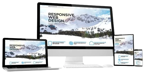
Responsive vs Non-Responsive Website
Desktop
Laptop
Tablet
Mobile
Why is Responsive Design Important?
According to official Google statistics in 2026, over 61% of Google searches are performed on mobile devices. This means most of your users visit your site on mobile! If your site is not responsive, it will frustrate users and you will lose them.
Benefits of Responsive Design
Dynamic Layout
All website components display properly in smaller format. The site perfectly adapts to the visitor's device size.
Flexibility
You can hide certain sections on mobile and replace them with alternative content.
Saves Time & Money
No need to design separate templates for each device. One template works for all.
Beat Competitors
Responsive websites attract more visitors from all device types and help you stay ahead of competitors.
Increase Sales
If your site works well on mobile, tablet, and every device, you'll get more traffic and more sales.
Improve SEO & Google Rankings
Google gives higher rankings to responsive websites and prioritizes them in mobile search results.
Principles of Responsive Design
Flexible Grids
Using grids that automatically adjust to screen size.
Flexible Images
Images designed to automatically scale to fit screen size.
Media Queries
Using CSS Media Queries to apply different styles at different screen sizes.
Mobile-First Approach
Designing for mobile first, then expanding to larger devices.
How to Ensure Your Website is Responsive?
Simple Method: Am I Responsive
Visit Am I Responsive and enter your website URL. It displays four versions of your site: desktop, laptop, tablet, and mobile.
Simple Method: Resize Your Browser
Exit full-screen mode and manually resize your browser window. If your site adapts, it's responsive.
Professional Method: Browser DevTools
Open your site, press Ctrl+Shift+I, then press Ctrl+Shift+M or
click the device icon. Now you can select popular phone and tablet models to test
responsiveness.
Additional Method: Google Test
Use Google Mobile-Friendly Test. Google will directly tell you if your site is mobile-friendly or not.
Responsive vs Non-Responsive Design
| Feature | Responsive Website | Non-Responsive Website |
|---|---|---|
| Mobile display | Excellent | Needs zoom & horizontal scroll |
| User Experience | Seamless and smooth | Poor and frustrating |
| SEO & Google Ranking | Higher score | Lower score |
| Development Cost | One-time cost | Separate cost for each device |
| Maintenance | Single version | Multiple separate versions |
| Bounce Rate | Low | High |
Useful Tools for Responsive Design & Testing
Advantages and Disadvantages of Responsive Design
Advantages
- ✓ Excellent user experience on all devices
- ✓ Improved Google ranking and SEO
- ✓ Reduced development time and cost
- ✓ Increased sales and conversion rate
- ✓ Compatibility with future devices
- ✓ Lower bounce rate
Disadvantages
- ✗ More time and cost initially
- ✗ Some older browsers don't support Media Queries
- ✗ May reduce loading speed (if not optimized)
- ✗ More complex design compared to fixed websites
Frequently Asked Questions About Responsive Design
What does responsive mean?
Responsive means your website automatically adapts to the user's device screen size (mobile, tablet, laptop, desktop) for an optimal user experience.
Why is responsive design important?
Over 60% of internet users browse on mobile devices. If your site isn't responsive, you'll lose these users. Google also gives higher rankings to responsive sites.
How can I tell if my site is responsive?
You can resize your browser window, use Am I Responsive tool, or test with Google Mobile-Friendly Test.
Is responsive design good for SEO?
Yes, Google gives higher rankings to responsive websites and prioritizes them in mobile search results.
Do all websites need responsive design?
Yes, almost all websites. Even corporate and personal sites may have users visiting on mobile. Today, responsiveness is a necessity, not a choice.
Is responsive design expensive?
The initial cost is slightly higher than a fixed website, but long-term maintenance costs are lower and ROI is better, as there's no need for separate templates for different devices.
📌 Conclusion
In the world of e-commerce, responsive design has become a necessity. Without it, you'll lose a significant portion of your users.
- Responsive means: Your site adapts to all devices
- Importance: Over 60% of users are on mobile
- Benefits: Better UX, higher SEO, cost savings
- How to test: Use Am I Responsive or Google Mobile-Friendly Test
When ordering website design, be sure to consider the responsive option to attract more audience and increase sales.
Need help with responsive website design?
I'm here to help you create a fully responsive and professional website.
Contact Me